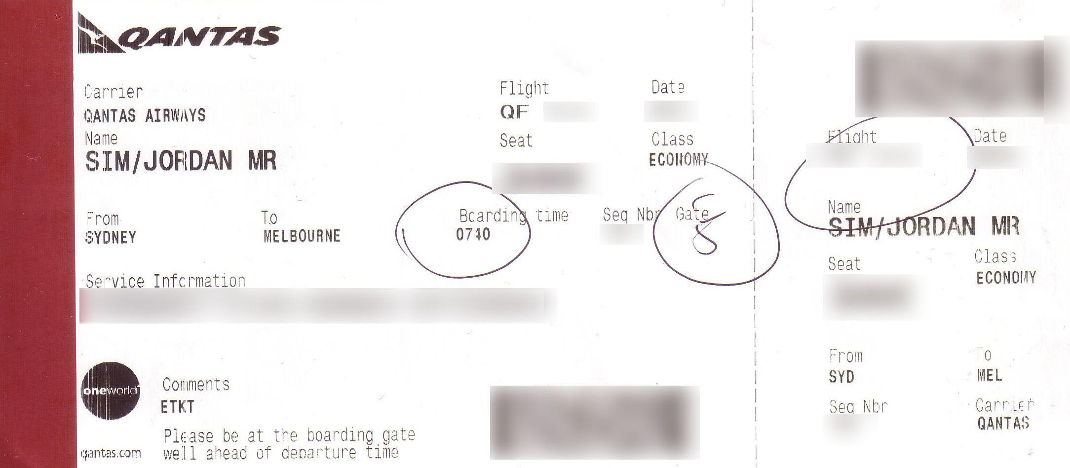
Over the past 7 weeks, I've spent more time in the airport than in my own bed at home. What this has resulted in, is me becoming a faux-quasi-David Attenborough of the airport landscape - I've accrued many hours just observing how passengers (including myself) interact with boarding passes. In User Experience (UX) land, we call this engaging in 'experience research' or 'ethnographic research', i.e. watching human behaviour towards a product/service to gain insight on how users interact with it (and how they don't interact with it). My finding? Current-day boarding passes aren't designed to be passenger friendly.
In this post, I will only be focusing on Qantas' boarding passes (I'm loyal to this carrier). But whilst I'm isolating Qantas, I can guarantee that it's a universal design problem across all carriers - just have a look at Boarding Pass/Fail by @tyler_thompson. I was introduced to this site by @jwswj after I had completed my re-design (see footnote).
Current Design
Redesign
My thoughts on the Current Design vs. Redesign
The placement of information in the current design lacks a natural logical flow
Many of the passengers I observed struggled to easily find their departure gate and boarding time from their boarding passes. Older-aged passengers called on the assistance of their travel companion, whilst younger-aged passengers took on average, roughly about 3 seconds to achieve this task.
I believe that this struggle is due to the lack of a natural logical flow of information in the boarding pass design. Adopting a Western-world reading pattern (from left to right) for the boarding pass, the string of information on the boarding pass can be read as:
The Carrier is Qantas Airways for Flight QF123 leaving on 15 June for me, the passenger,Jordan Sim. I will be seated in 31F in economy class travelling from Sydney to Melbourne and this flight has a boarding time of 7:40am with a sequence number of A123. I have to board at Gate 5 and my service information is Frequent Flyer Bronze QF1234567.
This string lacks a logical flow and the pieces of information do not harmoniously sit together to be easily memorised. Information accessibility is poor. Now compare this to the redesigned boarding pass:
I, Jordan Sim, the passenger, am travelling from Sydney to Melbourne on Flight QF433 on 06 June. I will board at Gate 5 at the time of 3:10pm. When I'm on the plane, my seat number is 39F.
Reading the redesigned boarding pass is easy - the pieces of information harmoniously work together to form a comprehensive string. In other words, the information is easily accessible.
The key difference is that the boarding pass has been designed through the eyes of the passenger (i.e. the customer). The information on the boarding pass directly mirrors the physical boarding process. It begins with the passenger travelling between 2 locations via a plane. The plane departs on a certain date from a certain gate at a certain time. Once the passenger has passed the gate, they have a seat on the plane.As such, it can be seen that customer interactions have been considered in the design of the new boarding pass. This makes it passenger friendly.
</rant>
What are your thoughts/opinions?
Add your comments below :)
FOOTNOTE: Whilst I am glad to know that I share a similar opinion as the UX experts towards boarding pass designs, I am simultaneously flat as my designs look similar to Tyler's even though they were designed completely independent of his.


